
Friday, 23 September 2011
Rationale
"An image driven investigation into typography, with a focus on branding identity across a range of media"


Thursday, 22 September 2011
1st brief writing workshop 22rd September 2011
My objectives for 3rd year.....
Improve software skills in all areas.
Web design - continuous development.
Become more confident about designing for print - and produce some work which exhibits this ability.
Typography software - teach myself how to use this and set myself a project where I can spend some time on this.
More branding and logo design - from putting together my website this Summer I have noticed areas in my portfolio that I am lacking. Branding and logo design is something that I plan to go into and I actually have little evidence of this.
3D typography - I experimented with this briefly in 2nd year as part of a freelance project, but I would like to set myself a brief which involves me embracing this.
Continue to explore hand rendered/image based typography - I have become more and more interested in this and want to continue this exploration.
Image driven design/illustration
Develop my conceptual abilities and aim BIG - I feel that I often think as radically as I could. I dismiss ideas before they even develop properly because I worry about how I will execute them, but I think I need to become more aware of my abilities and realize what my potential is.
Go back to basics - I want to continue my engagement with more traditional processes such as screen printing. I want to try and design more away from the computer, old school style. 20 years ago I probably wouldn't have had a computer and incredible design was being produced. I vow to only use my computer in the instance of formatting, time saving and to improve quality.
Spend more time researching past as well as contemporary design - I have spent a lot of time doing this this summer and as a result I feel much more in touch with what's going on in the design world, what the competition is and had a lot of ideas for my own practice.
Consider areas of interest - one of my main weaknesses last year in my opinion was my chosen subject matter. I failed to think of areas of interest when I needed to. This Summer I have recorded all my ideas in a little notebook which I can now apply to future work.
Get a placement for Christmas - I feel really disappointed with the outcome of my summer placement (or lack of) and I am already looking at other designers to contact more locally.
Improve visual documentation - I feel that my photography and display abilities let me down and dont't do my work justice.
Thursday, 26 May 2011
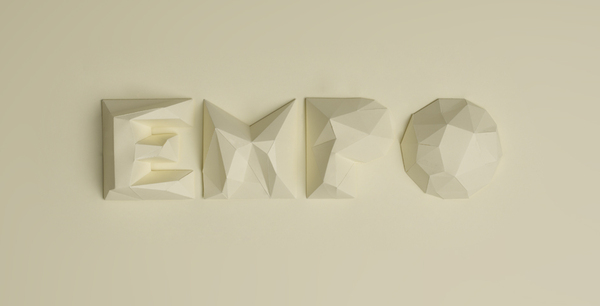
Lettering project for a psico-osteopathy school

This type was designed for a psico-osteopathy school. I think that it is interesting the way that both the specialist crafting process and the media reflect the purpose and function of the typeface; osteopathy is a hands on treatment and these have been crafted very much by hand, and the finished product in many ways reflect the image of human flesh and the angles of the body.

find your heart

This is another poster by designer Gretchen Nash. I think it is interesting the way that she has taken the concept of 'finding your heart' - essentially not a visual thing, more something that is entirely emotive and visually communicated it through the imagery of a handful of little wooden imitation hearts. The image itself is really charming and endearing despite the media that she has chosen to portray the message that the audience receives is sincere.
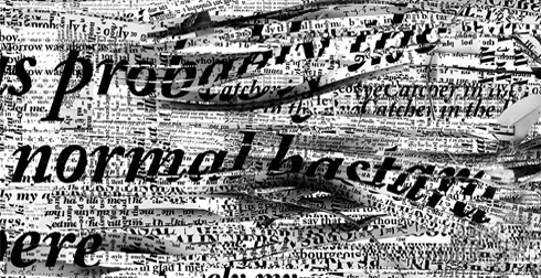
Salinger posters
This type poster is by an american graphic designer called Gretchen Nash. I am a huge fan of her work, and thought that this piece was particularly interesting. It is intended as a piece of promotional material for J.D. Salinger's 'The Catcher in the Rye'. I think that it is especially interesting how the choice of media and manipulation of the paper as well as the words reflects the aggressive writing style of the book.


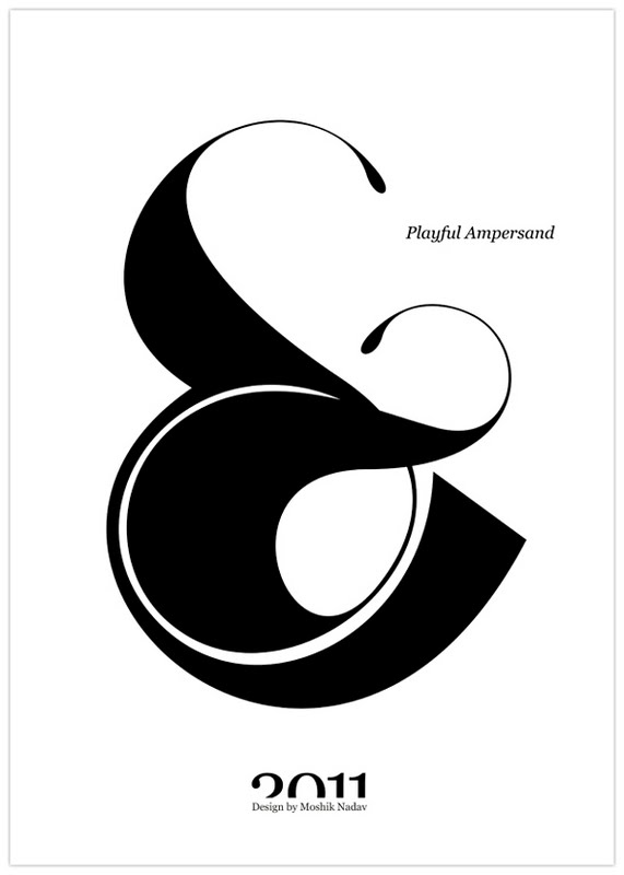
'playful ampersand'
These are a selection of the pieces produced for a project by type designer Moshik Nadav for a project called "Playful Ampersand". I really like both the subject of this project as well as the specialist design. To create these pieces requires good knowledge of the ampersand and its anatomy; I think that all of these, no matter how distorted, still successfully communicates to the audience the shape of an ampersand. This illustrates perfectly typography as a specialism.


Subscribe to:
Posts (Atom)