Monday 24 May 2010

INDESIGN_Beatriz Milhazes

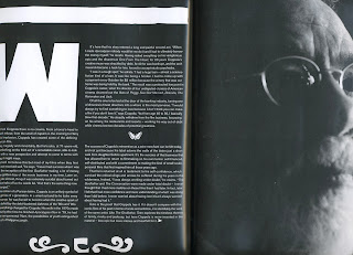
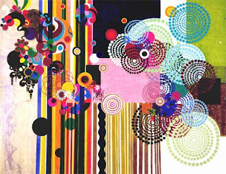
Beatriz Milhazes is Maya's favorite designer. I really like her use of multiple textures and interesting colours. I also like the feminine and intricate patterns and floral motifs which she uses. Her work is all about composition, it reminds me of flower arranging.


magazine page layouts


Don't Panic Live Brief_VOGUE


These are all images that remind me of the word "Vogue". I wanted to look at images such as this, but with a slightly lighthearted feel. I particularly love this lobster head dress and necklace. It is ridiculous but to me it mocks the concept of style and fashion, laughing at the ridiculous things that people will do and wear in the name of fashion.
I picked out his image because I love the stance of the model. I like the way she is showing of the garments but at the same time looks pained and awkward.


SPEAKING FROM EXPERIENCE_display and distribution ideas


Something the has come up in almost all of my crits is how I am going handle display/distribution of my product in a more specific way. I liked John's suggestions like attaching the products to helium balloons and setting them free, but there are a number of difficulties with that in terms of making sure the balloons reach their target audience! My first idea was to distribute them or just display them int the student union. My only issue with this is that the advice is aimed specifically at 1st year Graphic Design students, and here it would be available to all. I like the idea of some kind of display box, perhaps with a compartment for each letter of the alphabet. This way all letters are displayed at once, the display is portable, it could be designed in a similar style to the product, drawing attention to the products which themselves are small, so not as eye catching.I also like the less conventional idea of hanging the products on a washing line type string by pegs. Both these methods of distribution could fit into the first year graphics classroom or corridor. If none of these were suitable, there is always the option of making sure that every 1st year graphics student gets one in their starter pack along with their stationary.

Tuesday 11 May 2010

SPEAKING FROM EXPERIENCE_fonts

I have been looking at possible fonts for my designs. At the moment I am considering sticking to a minimal colour palette, possibly just black on coloured stock, so I want the font to be interesting on its own. I don't want anything too complicated as I don't want the attention taken away from the illustrations too much. I like the idea of a hand drawn font as this will be able to flow into the illustration more fluidly. These are three that I particularly like, I need to try them out before I can make any decisions about which works best as I can't visualize them with the illustrations just yet.


Monday 10 May 2010

SPEAKING FROM EXPERIENCE_condom packaging

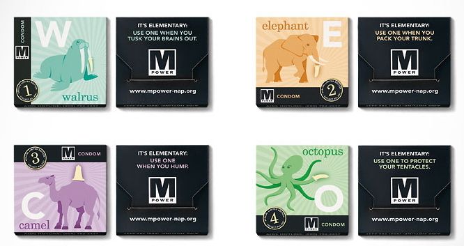
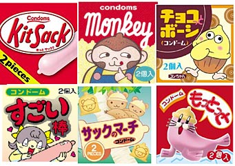
Condoms were one of the items voted most "usefull" in my recent survey, so I have decided to look into condom packaging design and see what I could come up with to promote my message but using free condoms..... I particularly like the 'match-box' style packaging as this provides a lot of space for the content of my message, for example the advice.


These designs are similar to my current concept; the a-z of advice for graphics students. I like the humourous edge to these designs with the play on words. I also like the collectable element of the condoms. Perhaps if each student were given one then there was a link to a website with more pieces of advice for the other 25 letters of the alphabet.
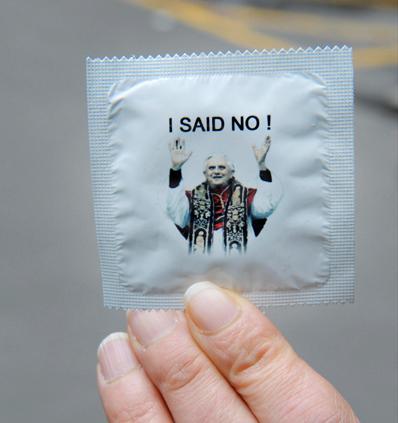
These condoms are named "the troublemakers".....


Sunday 9 May 2010

SPEAKING FROM EXPERIENCE_teabag packaging

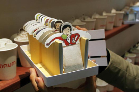
I found these tea bag designs when looking for references in relation to the 'what is graphic design for?' brief. I am looking into different ways of packaging tea bags in particular. Tea is something that not only is stereotypically associated with students at university but also as a student I can safely say that I drink a lot of it and so do my friends. I want the packaging to contain helpful advice to first year graphic students giving it a double function.
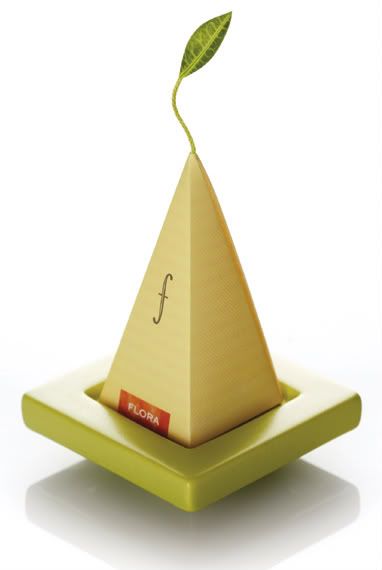
I am interested in looking at different ways of packaging the actual tea bag itself, as well as the string. I like the approach to packaging in this design: it's simple and compact but more interesting than a rectangle. I also like the branding, simply 't'....straight to the point.
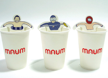
I like the way that the packaging is encorporated with the cup in this design.


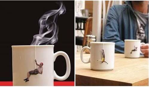
I love these little coat hanger tea bags. I am a huge fan of novelty, but I think that these have more class than novelty appeal. I think this ides would work well with marketing a fashion related buisness/designer. I like the idea of experimenting with different styles and methods of hanging the teabag to the edge of the mug. In this design they have considered the packaging of the group of tea bags as well which I think could be important with my work.


Saturday 8 May 2010

SPEAKING FROM EXPERIENCE_elin svensson

Elin Svensson is a graduate from the london college of communication who has set up her own creative studio AH with another fellow graduate. I was originally interested in her work in relation to the project in terms of unusual presentation and packaging, but I absolutely love all of her work particularly her unique style and interesting approach.


I think that the way that these clothing tags, posters and booklets are presented and packaged is really interesting. Although only packaged in a really simple way, it makes them interactive and intriguing to the audience. I love the way she has played with scale in an unconventional way and the way that the tags have this other function as postcard.


I like the concept for this publication: the fear of a blank page. This is something i fear, I have an uncontrollable habit of putting something down on a page even if it's just scribbles and undistinguishable marks. I think her childish illustrative style is really interesting and entertaining.


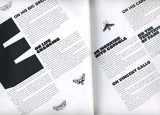
What I am mainly interested in for my project is the way she uses layout to make publications more visually interesting, for example, using the double page spread rather than working with each side individually. I also like the way that she uses a strongly image based theme at times, almost like a picture book.

Tuesday 4 May 2010

Postcards from Bristol Trip


SPEAKING FROM EXPERIENCE_Clothing Tag for "numph" clothing

SPEAKING FROM EXPERIENCE_brahm

I got these booklets from a welcome pack from the communications agency Brahm. I was really interested in the way that they presented their information, particularly these three booklets. Each contain a collection of information, and also similar content to what I have been investigating i.e. graphic design, students, a-z's etc.


This first booklet of '15 promises' is joined by one single pin so that the pages fan out on a kind of hinge. I like the simplicity of the design, while still being a book (which I am trying to avoid in my design), it has a more fun, interactive feel to it. I think more could be made of the back, for example an image could be printed on the reverse of the cards so that when it is opened it is displayed, yet while it is folded way it becomes invisible.

This little book 'the creative A to Z' is PR guide, each double pages spread having a letter with a small illustration and a definition of the letter/word given. While these all relate to things to do with PR, I very much like the layout and concept of the booklet. This was close to what I had in mind for my initial idea, but in a less conventional way.... while I am a massive fan of products that are novelty and simply to entertain, I think that given the brief, it would be more beneficial for the students if the product had a practical purpose.


I like the way that the designer has left room for the owners ideas at the back of the book, giving it more of a purpose.

These cards depict and explain 'A talent spotters guide to design students'. I absolutely love the concept and I think the packaging is lovely. I also love the way that they have depicted what type of student as a different kind of bird. Although the cards seem to have no function at first other than to entertain, they do in fact carry a link and a small bit of information about the SH! design awards. I like the subtlety of the advertising and the interactive nature of the product. I especially like the little envelope which encases them all. They remind me of collectable cards or something, like you might want to collect the whole set.