Thursday 26 May 2011

Lettering project for a psico-osteopathy school


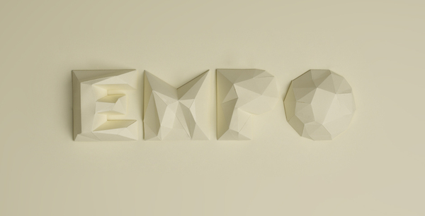
This type was designed for a psico-osteopathy school. I think that it is interesting the way that both the  specialist crafting process and the media reflect the purpose and function of the typeface; osteopathy is a hands on treatment and these have been crafted very much by hand, and the finished product in many ways reflect the image of human flesh and the angles of the body.


find your heart

This is another poster by designer Gretchen Nash. I think it is interesting the way that she has taken the concept of 'finding your heart' - essentially not a visual thing, more something that is entirely emotive and visually communicated it through the imagery of a handful of little wooden imitation hearts. The image itself is really charming and endearing despite the media that she has chosen to portray the message that the audience receives is sincere.

Salinger posters

This type poster is by an american graphic designer called Gretchen Nash. I am a huge fan of her work, and thought that this piece was particularly interesting. It is intended as a piece of promotional material for J.D. Salinger's 'The Catcher in the Rye'. I think that it is especially interesting how the choice of media and manipulation of the paper as well as the words reflects the aggressive writing style of the book.


'playful ampersand'

These are a selection of the pieces produced for a project by type designer Moshik Nadav for a project called "Playful Ampersand". I really like both the subject of this project as well as the specialist design. To create these pieces requires good knowledge of the ampersand and its anatomy; I think that all of these, no matter how distorted, still successfully communicates to the audience the shape of an ampersand. This illustrates perfectly typography as a specialism. 


web design

I really like this website design. I think that the simple colour palette works really well in terms of directing the viewer to the main content of the site, and the use of simplistic shapes help to frame the contents. In particular, I like the icons to direct and indicate the audience to different areas/pages of the site. They are extremely simple but communicate their purpose really effectively as well as re-iterating the shape of the main logo.


Web design

This is a website for a type designer. I came across it when researching for typography websites as I am designing on as part of the Product-range-distribution brief. This website has a lot of information that is required to be displayed, however I think that the information is displayed in a really interesting way that communicates clearly to the viewer. The website functions as a very long page with the buttons on either side sandwiching the main feed as well as buttons along the top. Considering the amount of information, I feel that this could easily look extremely cluttered and fussy. The reason I like it is that it doesn't. The design is very well considered - a restricted colour palette of just black white and a blue/turquoise colour for the main body of the sight. The choice of imagery is well considered - not too much visually in one go. I think that this is a good example of design executing a very successful function.


image driven typography

I found this piece of image driven typography interesting for both its subject/content and as a skill/specialist practice. I think that this is an interesting use of areas of negative space of the letterforms. I am not sure that the style of typography perfectly reflects the content - other than a vaguely retro style to both the language and the font. However I think that it is a really interesting typeface. I think that it works because of the well considered balance between the black weighted areas and the thin lines. The audience are simply intended to digest this as a readable and entertaining piece of design, which I think it does successfully.

Moshik Nadav - typography

This typographic design interests me particularly because it is skills driven. At the moment I feel that my design practice is heading towards image driven/decorative type as a specialism. However, at this moment in time I haven't got the skills to create more vector based artwork like this. This kind of decorative type almost stands alone as a piece of design. In many ways the word or letter is the context and the audience are asked simply to appreciate it for its aesthetic beauty.


Friday 20 May 2011

poster mail out packaging research

I particularly like this packaging idea for posters. I like how you can see part of the design through the clear plastic....


I am experimenting with designs for a simple cardboard tube at the moment. Although I think it is possible to exploit the texture and colour of the tube itself like in this example with a simple sticker or something, I think I want my design to have more decorative impact.

magazine packaging research

I am trying to design an interesting but functional piece of packaging for the magazine subscription. I dont want an over complicated design but I want it to be more visually appealing than a simple plastic sac wallet or a brown envelope....


I think that this design is interesting in the way that it comprises of more than one part.


Wednesday 18 May 2011

more websites with a hand rendered aesthetic

Things to consider when designing my hand rendered website would be continuity and consistency - the appearance and layout needs to be consistent throughout each page in some way so that it's not too confusing. Also, when using hand rendered type I need to consider scale and legibility. 


I like the idea of incorporating some images of the typography being created, e.g. rough sketches.....


websites with a hand rendered aesthetic

I am looking at websites that have been completely or partly hand rendered in terms of design. I want mine to have a similar aesthetic to keep it consistent with the theme of the brand - image driven/hand rendered typography.


Tuesday 17 May 2011

food edition research

I am looking at images of pea pods because I think that there shape could integrate well as part of a script font.

film publication research

 I think that a film clapper is an iconic image associated with cinema which could be a good starting point for my design for a film/cinema edition of Mark my words.