Saturday 5 February 2011

PACKAGING : CUT OUTS


I want to keep my packaging simple, including the artwork. I think I will use some of the artwork from the animation, including the type. I like the idea of using cut-outs, maybe to reveal elements of the artwork, and colour.... also I have never used the vinyl cutter which I would very much like to try out....


PACKAGING IDEAS : STRUCTURAL

I have been investigating the possibilities for the dvd packaging in terms of structure and nets.... ultimately I am sure that I want it to be made from a matt card stock, either in bright white, or screenprinting the design onto a light brown, parcel paper coloured stock. I want it too be visually simple, but that doesnt mean I don't want a well thought out clever design. I like some of these for the way that they look simple and clean cut, but the nets are actually fairly complex. One other specification is that I don't like the appearance of plastic, so I want to design a case that can hold the dvd safely without it. Most of these designs work in this way :


POP-UP PACKAGING

Due to the childish theme of my animation, I think that something pop up could be appropriate for my packaging. However,   I worry that although the theme is children's stories, the target audience for the show is ultimately adults.... not to say that pop-ups cannot be enjoyed by adults, but I feel that if that is the case I would be doing it purely for it's aesthetic as a design rather than for its appropriateness.


PACKAGING FOR DVD COVER

These are some cd packaging designs that I have like because I find them interesting or simply like elements of their design....
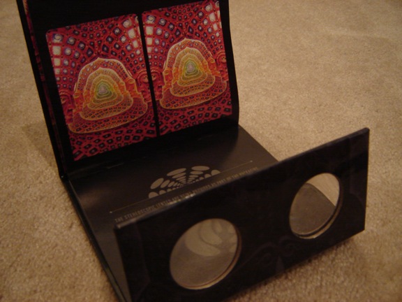
This first one I like the way that the design covers the whole case and sleeve with no margins. I also like the way that the images are cropped in this way and the way that the artwork mimics the shape of the cd on the pocket.

I like the stock used here which I think works really well with the spot uv varnish...

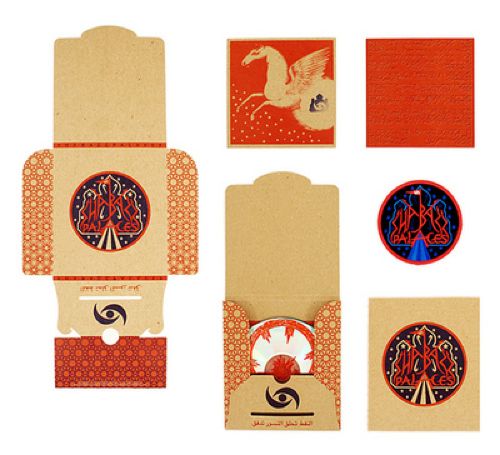
Again, I like this brown paper stock I think it works really well with the style of illustration and the black illustrations. I think a stock like this could suit my illustrations well, perhaps a screen print, then I could print some colours from the colour paletter I used in my animations....


These pieces of packaging are not necessarily what I am wanting to achieve, but I think they are pretty inspired...


Thursday 3 February 2011

Four soundtrack options :

I am still deciding between these four options. I have added them too my animation but am having some problems trying to upload them to vimeo. They all work really well with my title sequence so I'm finding it really hard to decide. I think I might try and get some feedback from my class and see what they think to help inform the most appropriate decision.