Owls by unknown illustrator.What I like about these is the simple geometric shapes and patterns that have been used to make up the forms of the owls bodies. I also think that the simple and restrained colour palette works well. It is made interesting by the colours and the shapes.


This use of type and image conveys a simple and fairly novel message. The image is used to support the text and reflect the theme of cake as a simile for love.

'Grow Side burns' by Marc Johns. I really like the simplistic, almost child-like illustrations and the abruptness of the message. It instructs rather than questions or persuades, but the message is slightly ridiculous which I think is why it works. You assume instantly that it is not assumed that you will take it seriously.
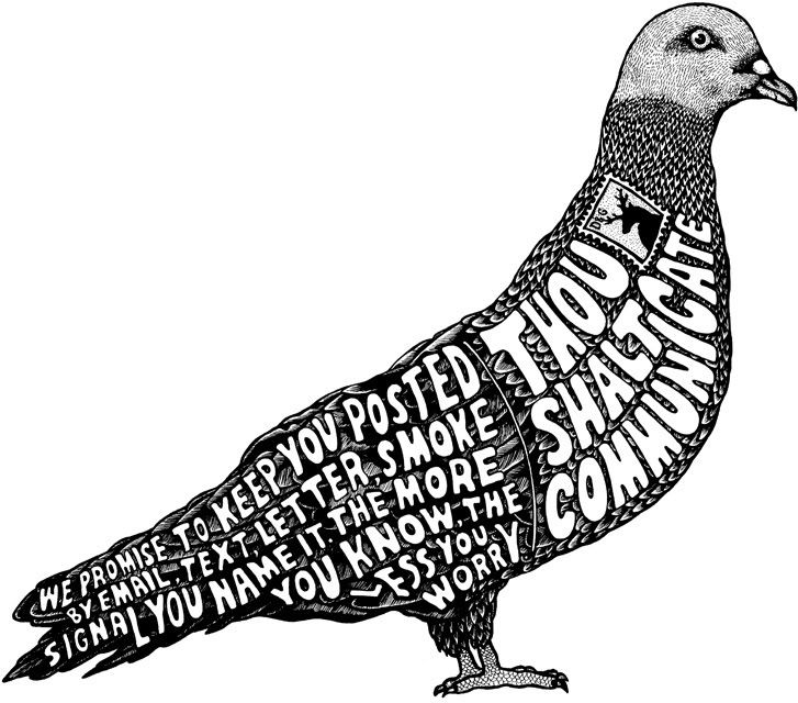
I love this type/image based piece for its incredible detail and use of line. I also like the formulaic patterns that the feathers make up, making it even more decorative. The theme of the imag is 'Thou shalt communicate' and the layout of the bird is actually a post card. I like the way that the illustrator has used the idea of a bird or perhaps carrier pigeon as a metaphor for communication.
I love the simplicity and innocence of these designs. They are lighthearted and funny and could be appropriate to a huge audience of people.
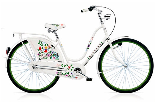
'Tree of Life Bicycle' by Electra Bikes. I think that these bikes are beautiful. The illustrations on the bike emphasise the eco-friendly message that is associated with cycling.
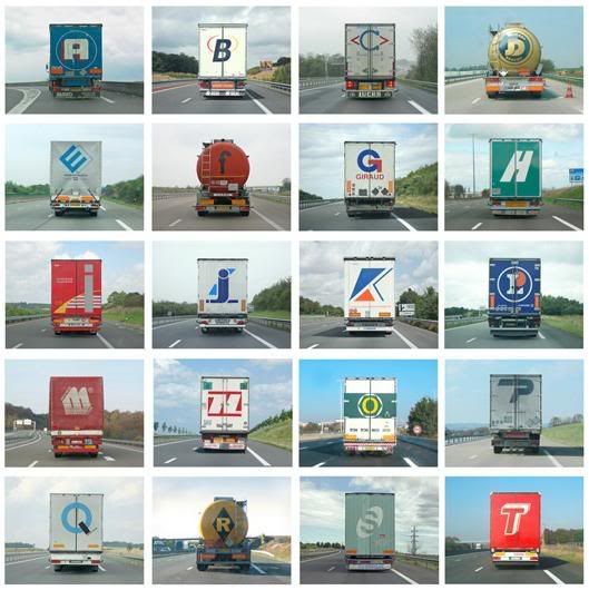
Images from book called 'Alphabet Truck' by Eric Tabuchi. I like the simple concept behind these photographs, and I think that it is facinating that Eric Tabuchi managed to find all these letters.
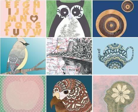
I love the encorporation of maps within the designs. I also love anything that involves birds. I don't know why, i just like drawing them.
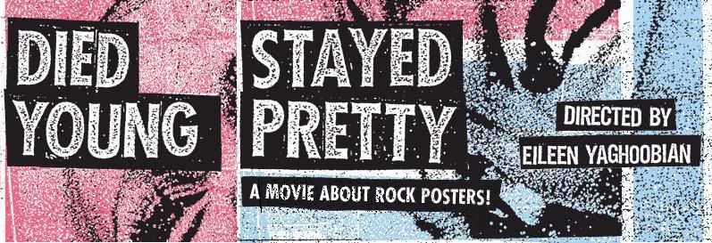
Poster advertising documentry about underground poster culture in North America
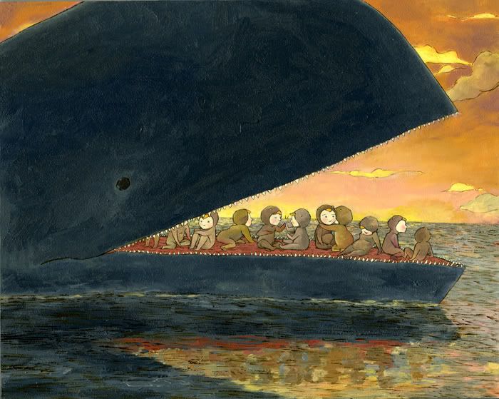
I have always been massively into childrens book illustrations, despite my addement refusal to ever work as a childrens illustrator myself. This is the first one i've seen in a while and really thought 'wow'. I love the kind of oriental style of the artist. Its such a magical fantasy image.
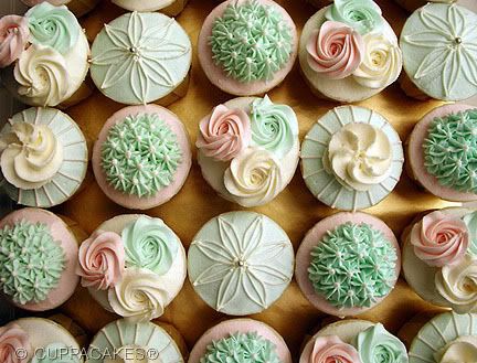
Image of cupcakes from 'Wondermilk Bakery', a shop in Kuala Lumpur, Malaysia which was set up by six graphic designers. Those cakes are absolutely INSANE
seriously rank, and i wouldnt say that it physically reflected anything i want to achieve as a graphic designer, but i love the twisted irony and shock factor
I just think that this is brilliant. I love the idea of being able to make up your own ring and i think it looks hilarious. anything that encourages unnecessary creativity is right up my street
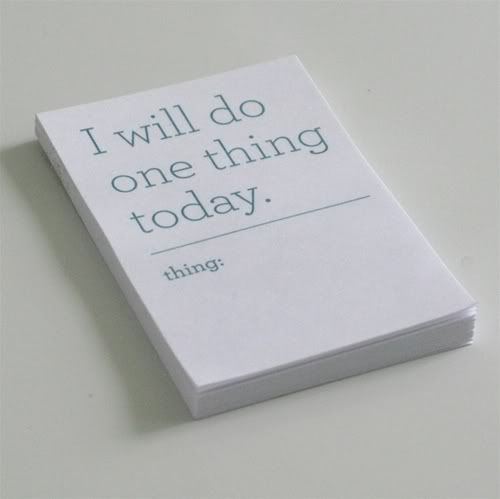
I love the simplicity of this pad. i can really relate to it in the way that sometimes,
when everything gets on top of you, its great to just get one of the many things you have to do done. im
a big list maker, i rarely complete all of the things on my list, but making the thing makes me feel at least half way there! everyone needs a positive outlook even at the most hectic of times
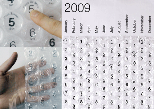
love it. it would be like having an advent calender every day of the year but you wouldn't get fat. plus everyone loves bubble wrap
I've always wanted to have a go at one of these
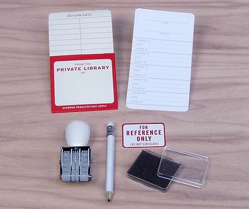
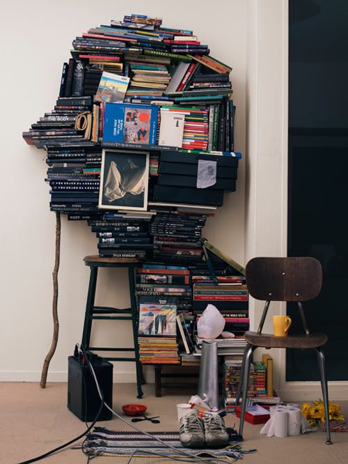
i think this is massively geeky, and i dont even own that many books, but i love the idea. bit o.c.d though to make your
friends sign out your books when they borrow them. i guess secretly everyone wants to be a librarian?
this is so cute and i love his illustrative style
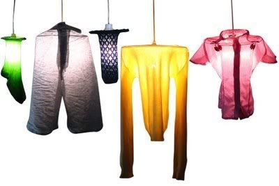
cool how they're made from re-used materials. frames support any number of clothing items!!! i always chuck my clothes over my lamp
but i actually thought that was a fire hazard. maybe not
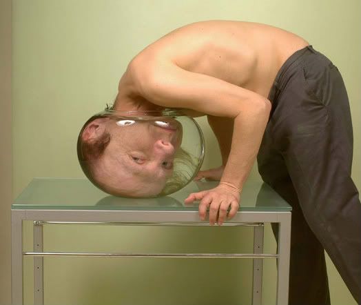
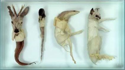
i find it pretty weird and not that nice to look at, but i love the way he has played with imagination and reality using photography.
we automatically trust photography, so when something looks as weird as this we are really taken aback
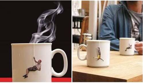
i love the fact that eaach teabag has a different character! as a big tea drinker, this would really appeal to me.
teabag strings are not the first place i think of when looking for graphic design, but considering how many people (especailly brittish people) drink tea, its probably a brilliant asthetic to play with. maybe even for advertising and promotion?
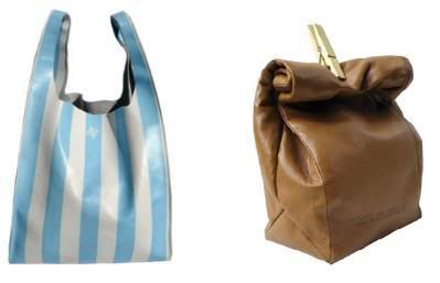
these shopping bags are really cool, if not slightly ridiculous, and probably very over priced.
probably appeal to silly rich people but if i was rich i'd buy one so i must be silly
i love the colours and textures of this image, and the way that the typography is so subtle
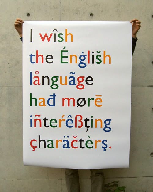
i chose to put this in because i kind of relate to it in the way that as much as no-frills, no-gimic type faces can look striking and work extremely well with image, i love a really
embellished over the top type face more than anything else
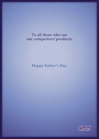
really eerie but hard hitting and a point well made. i like the lack of visual distraction from the message. mirrors the
matter-of-fact tone of the ad.
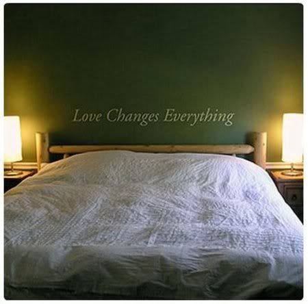
this is just one of many they do. i just like the concept of bringing typography and statements in general into interior design
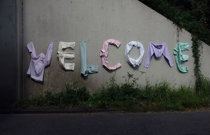
Garment Graffiti by Thomas Voorn
I like this tactile approach to typography, and soft and gentle approach to graffiti