Tuesday 29 December 2009

Where is Graphic Design? Remix Poster

I really like this font made up of electrical music elements. I think it's a really successfull way of promoting this night, and the kind of music that it's promoting.

Monday 21 December 2009

Where is Graphic Design? Adidas Originals by Jeremy Scott

I came across these trainers (nicknamed the 'JS Africa') when I was researching for the electronic poet live brief. I think that they very much fit into the 'Where is Graphic Design' research brief as they provide an example of graphic design in a less conventionally thought of situation. I love the way that the designer has created a contemporary tribal design in the form of a mask on the tongue, that also blends in with the traditional adidas originals logo. I also like the way that the tribal pattern is continued on the lining of the shoe. He has used simple primary colours, which i think work well to reflect the style of the brand and the African theme.


Sunday 20 December 2009

Where is Graphic Design? Nathalia Ponomarev

Origami Tea
I absolutely love the simplicity of this idea. The teabags themselves are visually beautiful to look at, and when photographed become a piece of graphic design, along with the packaging.

Thursday 17 December 2009

Where is Graphic Design? Aztec Tattoo

I came across this aztec inspired tattoo whilst doing some research for the electronic poet brief. I'd never seen anything like it before. I especially like the fine, delicate lines and the way that they make up quite a strong, tribal image of some kind of abstracted bird.

Where is Graphic Design? Billboards

I'll admit I'm not entirely proud of where I came across these images, but while I've been ill and pathetically trying to write my blog in between sleeping and moaning, I may have accidentally stumbled onto bored.com. However, I have found some really interesting billboards and other advertising campaigns. This is one of my favourites; an advertisement for an epilation centre, where the black strands coming from the bikini line are the contact details which you rip away!


This advertisment for piano lessons works in a similar way. I think this is a really simple and cheap way of promoting something.

Promotion for Che magazine

Max Factor's rain sensitive billboard for mascara.


Advertisment for Duracell batteries

Advertisment for skin care salon. I like how they have used texture to make their point. Simple but visually straight to the point.
I think what a lot of these pieces of graphic design show is that often it is a case of 'where'
as much as 'what'.

Wednesday 25 November 2009

tomoko takashi

I enjoy the chaos of Takashi's work, and I like the way that she experiments with radical compositions. However I don't fully understand the concept behind it. The compositions are interesting and clearly thought out to an extreme degree, but I find them too controlled.


Roni Horn

Horn tries to explore the mutation of art through her photographs. I find her work hypnotic and seductive, but there is certainly something eerie about some of her images.She decribes drawing as the key activity in all her work, because drawing is about composing relationships; which I think is a very interesting perspective. In many way's I think that this is very true and a very good way of explaining visual communication.


tim noble & sue webster

I think these are really interesting images; they make you doubt your perception of things, and how they initially appear. I also love the self-portrait element of the photographs; the shadows typically being silhouettes of themselves.


Annie Liebowitz

Annie Liebowitz has the ability to really capture the character and personality of her model; whether it be celebrity or stranger. I think that it is this skill that makes her such an incredible photographer. There always seems to be a real connection between model and photographer, which is extremely apparent in her work.


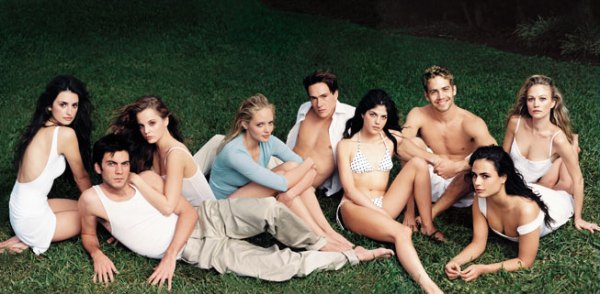
What I love most about these images for Vanity Fair is the way that the groups of famous actors and actresses that we would normally associate with being fairly untouchable, are presented to be casually grouped together to create some kind of super-celebrity. I also love the composition; the way that the images run across 3 pages but together make one long phototgraph.


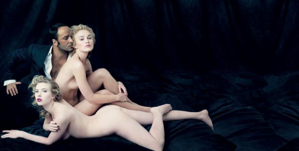
A lot of her images are flirtatious and sexual, but also reflect very classical compositions.
I also lover her sense of humour, for example the image below:


She seems to capture the image of the 'celebrity'; strong, god-like characters, with an elevated status from the rest of us, as well as she manages to create the weak and the vulnerable. In this image of a victim of domestic violence, you really can read her pain; the way that her gaze is lost and longing, and the fact that she doesn't look straight on at the camera. I think that it is Liebowitz's ability to build relationships with her models that encourages them to bare themselves to the camera fully.


This photograph of Yoko Ono is one of my all time favourite photographs. I can't put my finger on why exactly, as I don't find the composition as intriguing or as interesting as some of her other work, but I just love the subtlety of it. She has a wonderfull abitity to capture a persons persnality.

Erika Raberg

I find this image by Erika Raberg both disturbing and really beautiful. The childhood iconography of a child with a bunch of balloons is something that you associate with being innocent and angelic, but this photograph radically alters your perception of that image in an instant. Even though all that is vi sable is the balloons and the tiny feet poking out of the bath, you know exactly what is being depicted. I think that you could draw multiple messages from this image, such as the death of a persons childhood etc. I actually find this image strangely beautiful and not at all sinister.


Ablelardo Morell

In these images by Ablelardo Morell, he appears to have exposed two images into one composition, creating some really interesting images. What I like especially is the contrasts he draws between outside and inside.


Jeff Wall

I love the implied spontaneity of this image by Jeff Wall. The blown paper creates a horizontal pattern along the bottom of the composition. I also love the amount of space in this photograph, the main event of the image occurring in the bottom third of the composition, with the spindly branches of the tree creeping up into the two top thirds.

Sunday 22 November 2009

What is Graphic Design? Part Two: Work the Metaphor


These images show the 3D recreations of Milton Glaser's 'I Love NY', by typographer Oded Ezer. This is a good example of a designers own interpretation of an image from the past. I really like the effect, and I think it represents a contemporary take on a once modern design.


This image is an advertisement for a graphic design company called dDesign, which specialises in packaging design, mainly in the food industry. I love the simple representation of packaging with the use of an egg shell, and the way that it appears as though it has been printed onto. What I especially like is the choice of object, as an egg is a perfectly designed element within nature, giving the message of perfection, practically and a really organic form.


These Australian advertisements for Purell, to promote sanitizing your hands demonstrates the message the 'You are what you touch' by using the visual imagery of a hand, made up of all the things that you have come into contact with that day on your hand. I think the idea works because the message is clear, and it really does make you think about what you have on your own hands. The love the illustrations, which I think are really eye-catching. The image of the product in the bottom right hand corner really helps to bring the whole concept together, making it clear what the message is.


This PR logo for 'The Talk' is a good example of a visual metonym. I think the way that they have used easilly regognisable symbols (i.e. quotation marks) to create the image of a face talking works really well because of its clever but simple representation.


These images are by German graphic designer Axel Peemöller. To create these images he has attatched a pen to the end of a metal wire, the other end connected to the mouse. In doing this he has recorded the mouse movement on paper while he has constructed the letterform digitally. The messages that I interpret from this, are the contrasts between the digital and the hand drawn, and the perhaps the hidden creativity and energy that goes into creating each letterform which we wouldn't normally be aware of. I simply love the concept, and I think it produces some really interesting visual results.


Another design by Axel Peemöller that I came across was this way-finding-system for the Eureka tower car park, which is in Melbourne. He distorted the letters on the wall so that they can be read perfectly when standing at the right position. I think that this is a really interesting way off communicating a message to an audience (i.e. the drivers).


In this Greenpeace campaign against GM foods, the designer is trying to communicate the question of whether you actually know what is in the food you eat. They have done this by sing the visual metaphor of a scorpion made from carrots. I like the concept being delivered; that perhaps you should take a second glance at the food you eat, but I think that without the information at the bottom of the poster it would be difficult to understand the message. On the other hand, I think that it is a very eye-catching image which makes you look twice, which is exactly the point in the campaign.


This image portrays the message the 'Knowledge is power' by using the visual metaphor of a gun to suggest the power element of the idea. The words themselves are used to make up the form of the image, making the message even more clear to the audience. I think that this is a clever metaphor, but the message is not as subtle as some of the other examples I have looked at.