

Tuesday, 27 October 2009
Eduardo Recife
I came across Eduardo Recife in one of my illustration books. I love the way he uses all kinds of collage and photomontage to create these extremely interesting pieces of graphic design. I like the soft tones and pastel colours that he uses, so as not to distract from the delicate, unoffensive nature of the work.


Mark Raven
Mark Raven is a painter/printmaker from Amsterdam. This is my favourite piece of his, 'Bicycle I'. I love his minimal use of line, the monochromatic colours and the simplistic composition.


Monday, 26 October 2009
Royksopp Kinetic Typography
I think that this is a really interesting piece of kinetic typography. What I especially like is the way that at first only feedback squares are used to visually communicate the sound, only using words when the lyrics in the track come in to the point where they can be heard clearly.
Neverwork
This screen print is titled 'Bombed out' by a printmaker called Neverwork. I like the simplicity of the design both in concept and in the palette of colours used.

Paul Insect
I came across this screen printer when I was researching the artwork for DJ Shadow. I always admire his album artwork, for example the blue print at the bottom was for Dj Shadow's album 'The Outsider'.


Quentin Blake
As I have mentioned previously, Quentin Blake is a huge influence on my style, particularly my illustrative work. I was, and still am a huge fan of the Roald Dahl books. I love the way he manages to capture Dahl's characters so perfectly, including the dark and sinister side to a lot of them. I wish that Dahl's adult books had Blake's illustrations as well, where the characters are just as interesting and probably darker than ever.

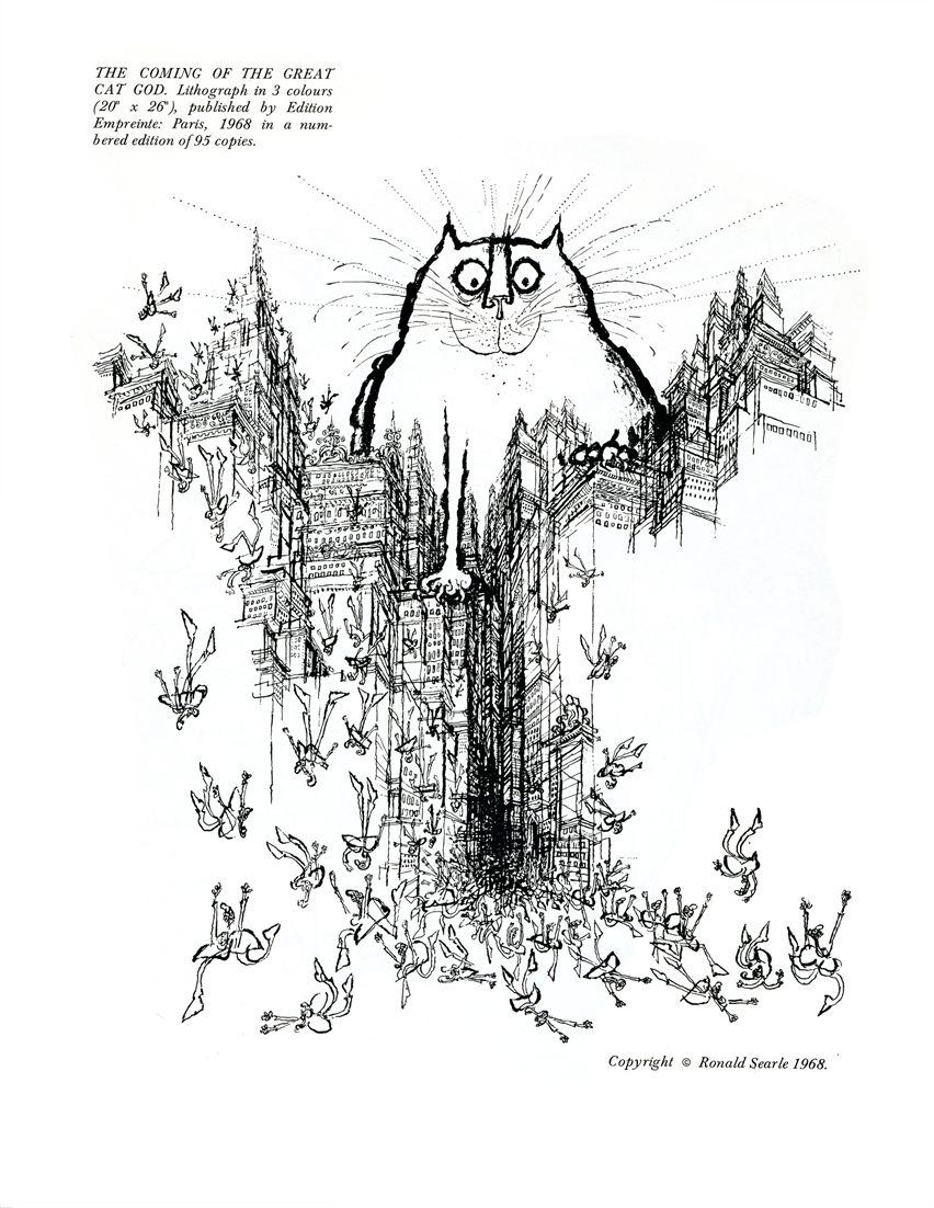
Ronald Searle
I would say that Ronald Searle's work is probably the most influential on my personal drawing style. Not necessarily directly; but I have grown to learn that a lot of other artists and illustrators that I admire are almost certainly influenced by him, for example Gerald Scarfe and Quentin Blake. When I first came across his work, I was shocked at how stylistically similar my work is to his, and I fell in love with him instantly. I love the way that he uses inks, both in heavy and dark lines, and watered down to create sweeping graduated tones.


Sunday, 25 October 2009


Sonia Bechira
Sonia Bechira is a Romanian Graphic Designer. I absolutely love her website:
http://www.bechira.com/main.html
Its very interactive and the layout is really interesting.


handmadefont.com
These are some fonts from a website I came across called There are some really interesting experimental fonts on the site; these are a few of my favourites....


Subscribe to:
Comments (Atom)