Tuesday 29 December 2009

Where is Graphic Design? Remix Poster

I really like this font made up of electrical music elements. I think it's a really successfull way of promoting this night, and the kind of music that it's promoting.

Monday 21 December 2009

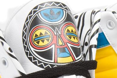
Where is Graphic Design? Adidas Originals by Jeremy Scott

I came across these trainers (nicknamed the 'JS Africa') when I was researching for the electronic poet live brief. I think that they very much fit into the 'Where is Graphic Design' research brief as they provide an example of graphic design in a less conventionally thought of situation. I love the way that the designer has created a contemporary tribal design in the form of a mask on the tongue, that also blends in with the traditional adidas originals logo. I also like the way that the tribal pattern is continued on the lining of the shoe. He has used simple primary colours, which i think work well to reflect the style of the brand and the African theme.


Sunday 20 December 2009

Where is Graphic Design? Nathalia Ponomarev

Origami Tea
I absolutely love the simplicity of this idea. The teabags themselves are visually beautiful to look at, and when photographed become a piece of graphic design, along with the packaging.

Thursday 17 December 2009

Where is Graphic Design? Aztec Tattoo

I came across this aztec inspired tattoo whilst doing some research for the electronic poet brief. I'd never seen anything like it before. I especially like the fine, delicate lines and the way that they make up quite a strong, tribal image of some kind of abstracted bird.

Where is Graphic Design? Billboards

I'll admit I'm not entirely proud of where I came across these images, but while I've been ill and pathetically trying to write my blog in between sleeping and moaning, I may have accidentally stumbled onto bored.com. However, I have found some really interesting billboards and other advertising campaigns. This is one of my favourites; an advertisement for an epilation centre, where the black strands coming from the bikini line are the contact details which you rip away!


This advertisment for piano lessons works in a similar way. I think this is a really simple and cheap way of promoting something.

Promotion for Che magazine

Max Factor's rain sensitive billboard for mascara.


Advertisment for Duracell batteries

Advertisment for skin care salon. I like how they have used texture to make their point. Simple but visually straight to the point.
I think what a lot of these pieces of graphic design show is that often it is a case of 'where'
as much as 'what'.