
These images show the 3D recreations of Milton Glaser's 'I Love NY', by typographer Oded Ezer. This is a good example of a designers own interpretation of an image from the past. I really like the effect, and I think it represents a contemporary take on a once modern design.


This image is an advertisement for a graphic design company called dDesign, which specialises in packaging design, mainly in the food industry. I love the simple representation of packaging with the use of an egg shell, and the way that it appears as though it has been printed onto. What I especially like is the choice of object, as an egg is a perfectly designed element within nature, giving the message of perfection, practically and a really organic form.

These Australian advertisements for Purell, to promote sanitizing your hands demonstrates the message the 'You are what you touch' by using the visual imagery of a hand, made up of all the things that you have come into contact with that day on your hand. I think the idea works because the message is clear, and it really does make you think about what you have on your own hands. The love the illustrations, which I think are really eye-catching. The image of the product in the bottom right hand corner really helps to bring the whole concept together, making it clear what the message is.


This PR logo for 'The Talk' is a good example of a visual metonym. I think the way that they have used easilly regognisable symbols (i.e. quotation marks) to create the image of a face talking works really well because of its clever but simple representation.

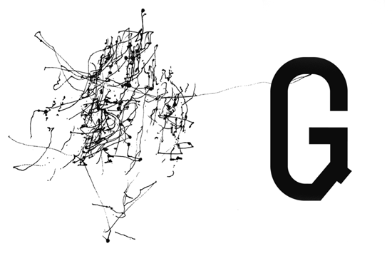
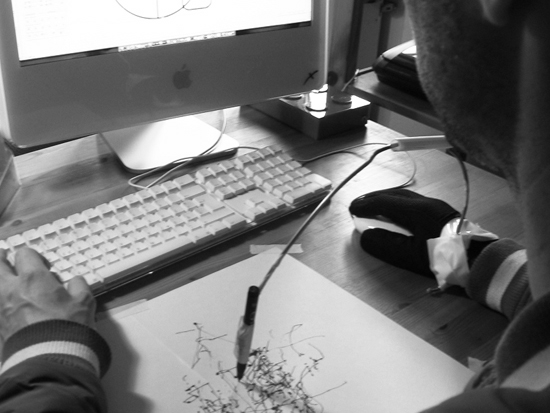
These images are by German graphic designer Axel Peemöller. To create these images he has attatched a pen to the end of a metal wire, the other end connected to the mouse. In doing this he has recorded the mouse movement on paper while he has constructed the letterform digitally. The messages that I interpret from this, are the contrasts between the digital and the hand drawn, and the perhaps the hidden creativity and energy that goes into creating each letterform which we wouldn't normally be aware of. I simply love the concept, and I think it produces some really interesting visual results.

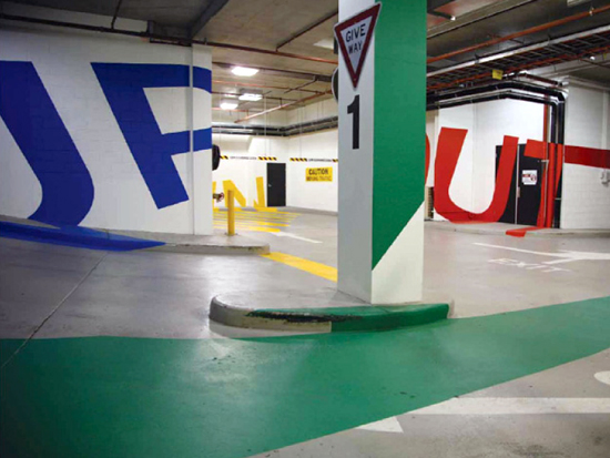
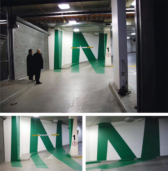
Another design by Axel Peemöller that I came across was this way-finding-system for the Eureka tower car park, which is in Melbourne. He distorted the letters on the wall so that they can be read perfectly when standing at the right position. I think that this is a really interesting way off communicating a message to an audience (i.e. the drivers).


In this Greenpeace campaign against GM foods, the designer is trying to communicate the question of whether you actually know what is in the food you eat. They have done this by sing the visual metaphor of a scorpion made from carrots. I like the concept being delivered; that perhaps you should take a second glance at the food you eat, but I think that without the information at the bottom of the poster it would be difficult to understand the message. On the other hand, I think that it is a very eye-catching image which makes you look twice, which is exactly the point in the campaign.


This image portrays the message the 'Knowledge is power' by using the visual metaphor of a gun to suggest the power element of the idea. The words themselves are used to make up the form of the image, making the message even more clear to the audience. I think that this is a clever metaphor, but the message is not as subtle as some of the other examples I have looked at.

No comments:
Post a Comment