
This album cover for De La Soul' album 'De La Soul is Dead' shows a visual metaphor in response to the public view of them as music artists. De La Soul did not necessarily follow the modern trends in rap, like guns and violence, so gained a reputation for being a bit 'soft'. As a response to this they used the image of some pretty, innocent flowers that have been savagely pushed over!

This visual metonym entitled 'Follow Passion, Not the Buck' uses simple symbols to make reference to love and money. It works because these symbols are universally recognisable, including the 'greater than' symbol linking the two and explaining the entire context of the image.


This visual metaphor really made me laugh. Simple imagery on a toilet of a plane 'dropping bombs' need I say anymore?

This image by Michal Batory is to advertise a piano competition. He cleverly uses a visual metaphor, using black and white skinned fingers to represent a piano, as well as possibly communicating messages of racial unity.

In this image, 'The World in our Hands', the designer is trying to communicate the idea that what happens to out planet is down to us. They have used extremely simple imagery to communicate this in the form of a visual metaphor, using hands cupped gently to represent the world. The image is subtle and personal.

In this photograph by Mladen Penev, the visual metaphor is the way that the 'Power of books' is being represented in a very physical and powerful way, whereas in reality books have no physical force in this way. The message communicated to the audience is that books can have more impact on you than you'd perhaps imagine. I love the way that Penev has managed to actually create some fairly dark visual imagery in relation to books.

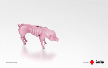
In this campaign advertisement, the American Red Cross are using an image of a starving pig money box as a metaphor for the lack of funding. The message is instantly clear; a piggy bank is an iconic image that arguably everyone recognises, but the undernourished pig show here instantly communicates the idea of a lack of money.
This image for poster by Luba Lukova uses very simple, literal imagery, with a no nessacarilly straight forward meaning; she is using an umbrella skeleton to suggest a lack of cover, and the medical symbol as the handle of the umbrella to subtley communicate the link to health. This is how the audience discover that the message is about health coverage.

This editorial cartoon by Manny Francisco uses visual metaphor to communicate his view of BNP Paribas.

In this visual metaphor the designer is communicating the idea of your brain working for you. Although the image is highly detailed, the actual visual message is pretty straight forward.

No comments:
Post a Comment