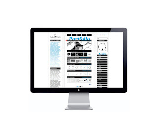
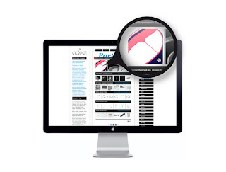
This is a website for a type designer. I came across it when researching for typography websites as I am designing on as part of the Product-range-distribution brief. This website has a lot of information that is required to be displayed, however I think that the information is displayed in a really interesting way that communicates clearly to the viewer. The website functions as a very long page with the buttons on either side sandwiching the main feed as well as buttons along the top. Considering the amount of information, I feel that this could easily look extremely cluttered and fussy. The reason I like it is that it doesn't. The design is very well considered - a restricted colour palette of just black white and a blue/turquoise colour for the main body of the sight. The choice of imagery is well considered - not too much visually in one go. I think that this is a good example of design executing a very successful function.


Wow interesting !
ReplyDeleteat istartus.com Web Designing and Web Development is our specialty.We have substantial capability to present you efficiently to the web audience...
I want to design a website on affiliation marketing and i have heard that E-Commerce Design is must to get the better results and traffic.
ReplyDeleteWeb design